
Problem
Goal
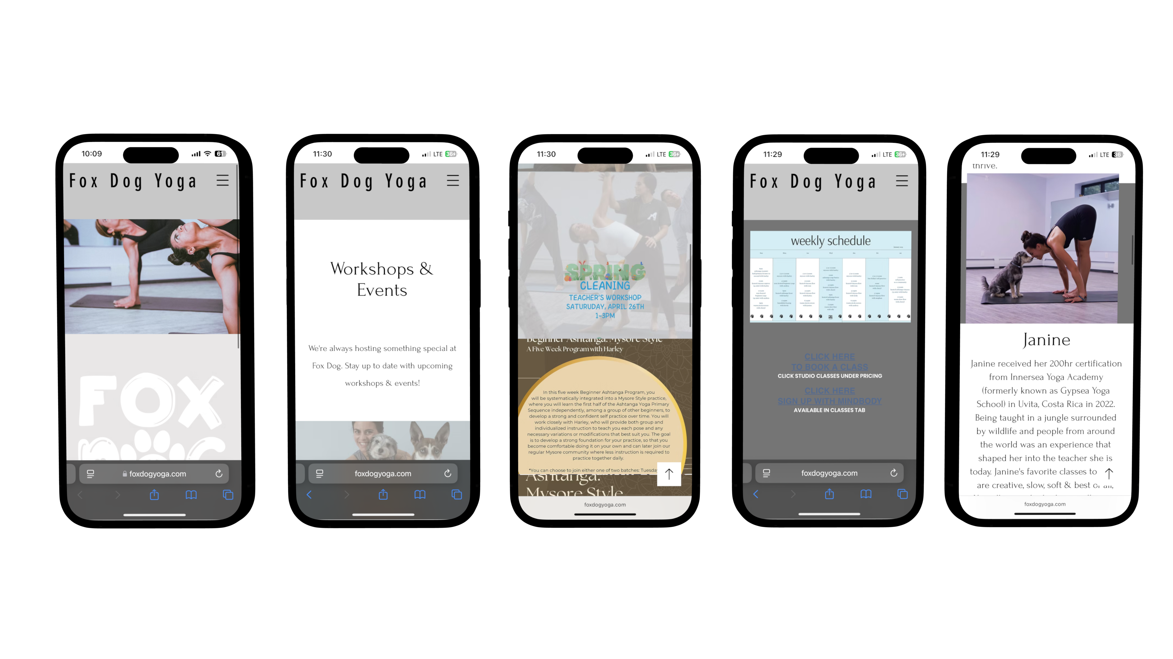
Fox Dog Yoga’s original website made it difficult for users to engage with the studio, pricing information was hard to find, the class schedule was difficult to read—especially on mobile and there were no CTA for booking. Inconsistent typography and layout also affected the overall user experience.
My goal was to create a more intuitive, mobile-friendly experience that clearly communicates class offerings, simplifies booking, and reflects the welcoming atmosphere of the studio. I also focused on improving accessibility and visual consistency to ensure a smooth experience for users.
Tools
Role
Figma
FigJam
Rotato
Google Meet
Wix
Chat GPT
Maze
Survey Monkey
UX/UI Designer
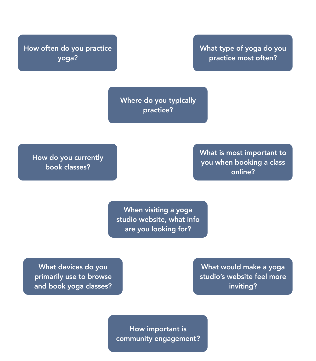
To better understand the needs and behaviors of potential users, I conducted a user survey targeting 50 participants, both experienced yoga practitioners and newcomers. The survey collected responses on how users currently book classes and what features they value most. Key focus areas included booking habits, preferred device usage, clarity of schedule and pricing. This research helped identify usability gaps and inform the direction of the new design.
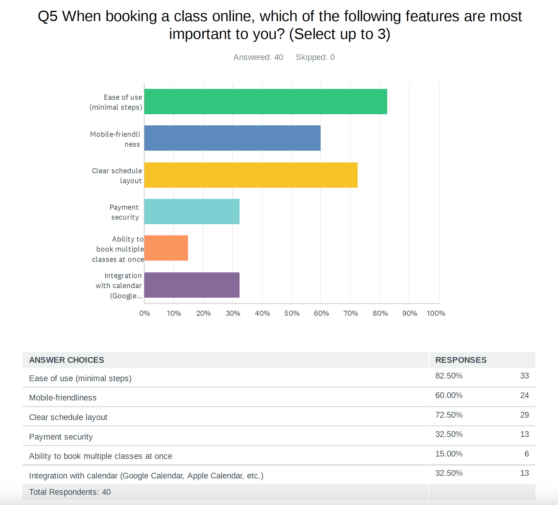
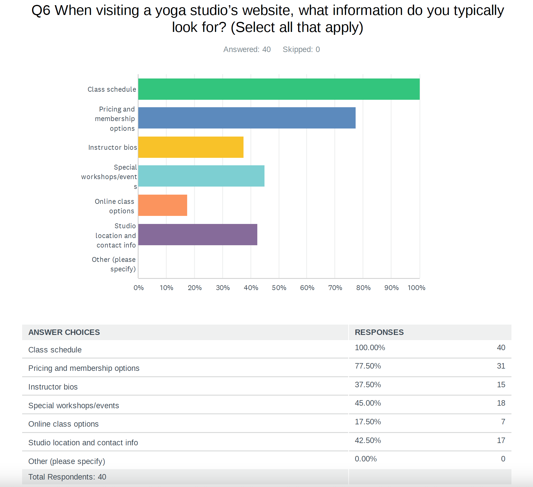
The user research survey for Fox Dog Yoga revealed key insights about user preferences and pain points regarding yoga studio websites and booking experiences. Most respondents (70%) practice yoga in a studio, with Vinyasa being the most common style (67%). Class booking is primarily done through third-party apps like Mindbody (68%) or directly via studio websites (25%). When booking online, users prioritize ease of use (83%), clear schedule layouts (73%), and mobile-friendliness (60%).
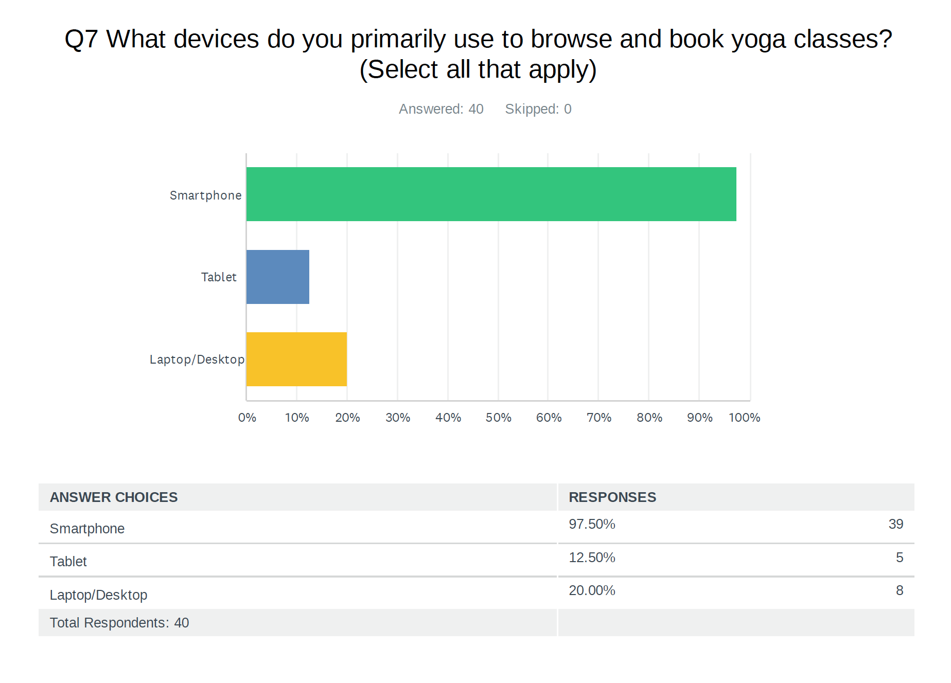
On studio websites, the most sought-after information includes class schedules (100%), pricing and membership options (78%), and instructor bios (38%). A large majority (98%) use smartphones for browsing and booking, highlighting the need for mobile optimization.
Users also noted that inviting websites should feature warm, calming colors, high-quality imagery, easy-to-read typography, and clear calls to action. Open responses indicated that users want improved clarity around pricing, booking, and navigation. These findings emphasize the importance of a user-friendly, visually engaging, and mobile-responsive website experience.
A competitor analysis was completed of two existing yoga studio websites (Solntse Yoga and Just Breathe Yoga) to identify strengths and weaknesses within the Fox Dog website, as well as improve overall user experience.
-Solntse Yoga displays their logo at all times when scrolling through the website in the top left corner, acting as a clickable “home” button. I think this is important as it includes the brands identity at all times.
- The hamburger menu scrolls out of view from the user while they browse through the website, for Fox Dog the nav bar will scroll into view for easier navigation.
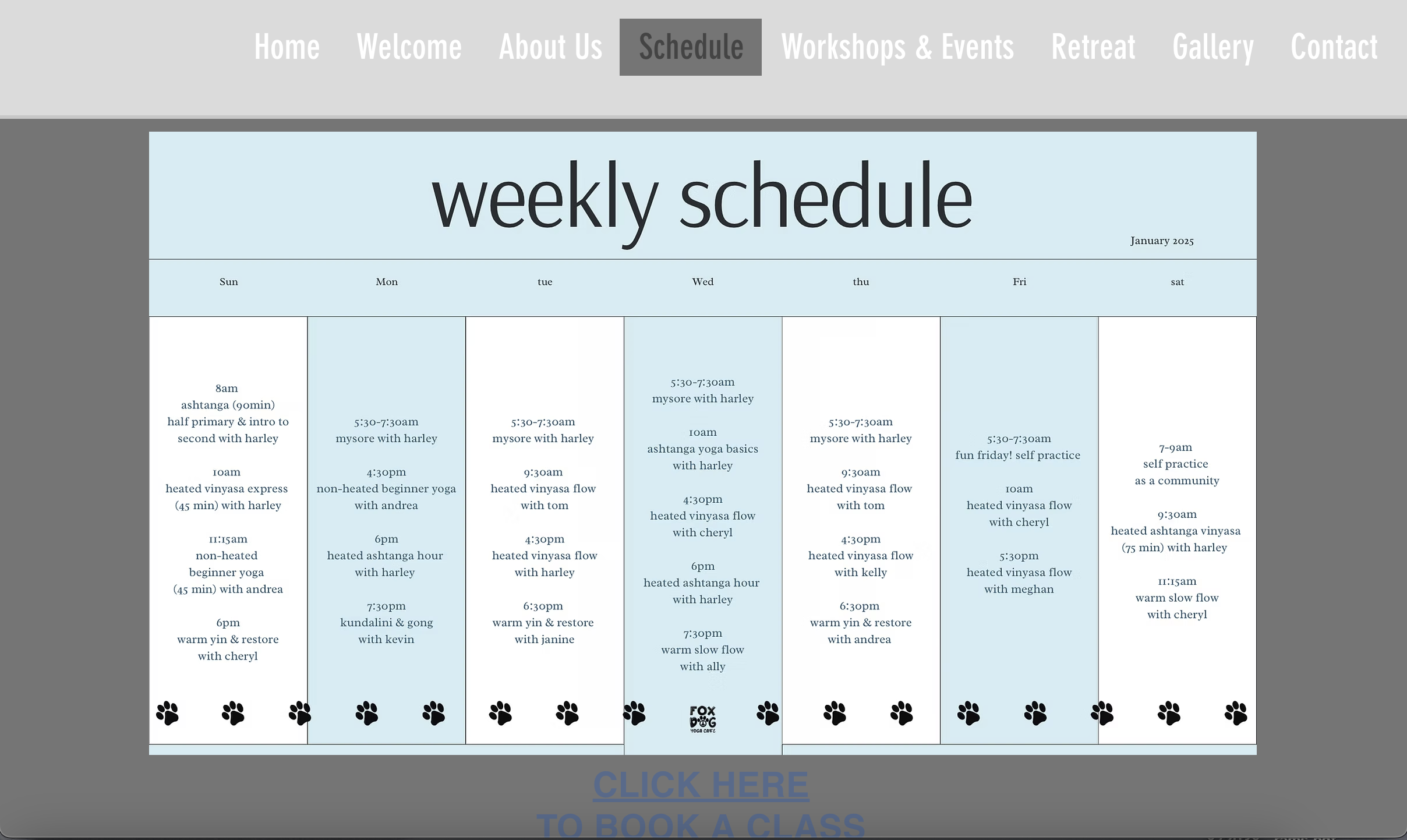
- The class schedule for Solntse is easily readible and offers a clickable calendar to choose a date and class, which is important for users so they can browse through various classes.
- Solntse also offers their pricing on a separate tab which makes it easier for users to see their packages and deals offered. Fox Dog should follow a similar style by placing their pricing directly on the website so the user does not have to go to a third party site to find pricing and cancellation policies.
- Just Breathe Yoga has a large navigation bar, with lots of information and a drop down for each clickable item. Fox Dog will have a smaller navigation bar containing a shorter list of options, as to not confuse the user.
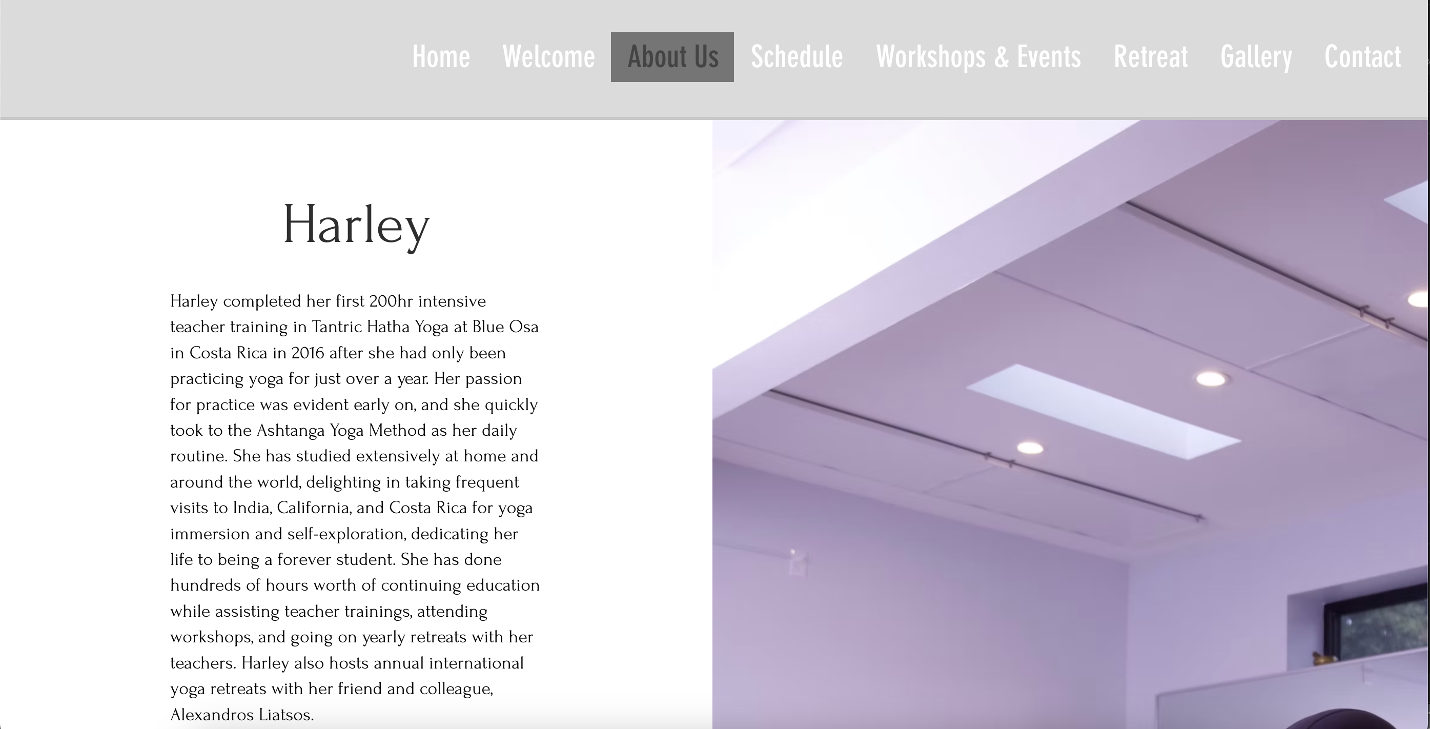
- Just Breathe yoga has a separate page dedicated to showcasing their instructors. The layout is simple with an image of the instructor, their name, the classes they teach and the instructors name is a clickable button to read more about the instructor. Fox Dog currently displays too much information on their instructor page and they will follow a similar format including a “read more” button so users can choose to read more about each instructor instead of having to scroll through.
- Just Breathe also has a “book a class” button in the navigation bar making it easier to navigate to this section for the user, Fox Dog should look to follow a similar style, making it easier for the user to book a class.
- Color contrast issues within the navigation bar on the desktop version.
- The home page has no relevance as there is no information portrayed on it, it can be condensed with the welcome page.
- A “read more” button is available on the welcome page but the button does not direct the user anywhere.
- Inconsistent use of fonts and colors throughout the website. Ie. Grey background, white background and different fonts and styles used throughout.
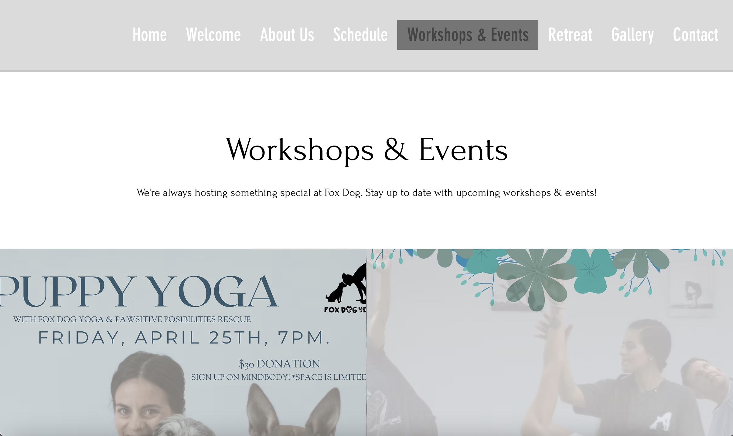
-Spacing issues on pages to separate content. ie. the workshops/event page.
-The schedule is difficult to view on both mobile and desktop.
-I’m not seeing on the website the prices of classes or memberships. This could deter users as they want to know immediately before booking.

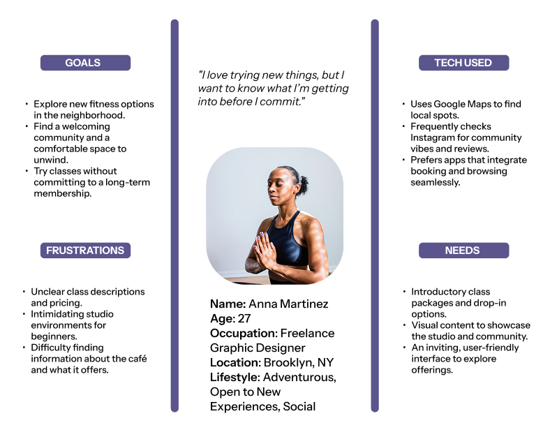
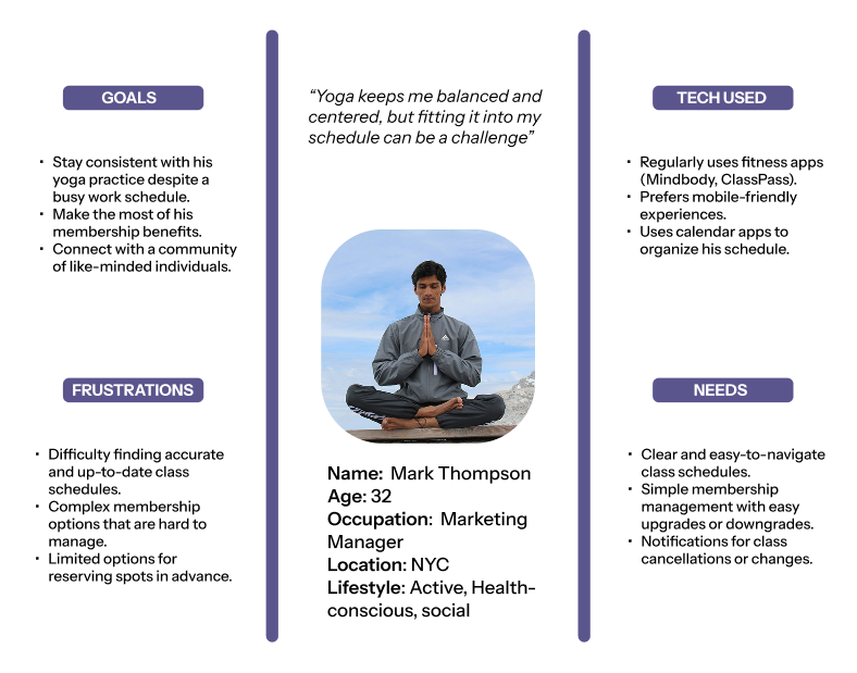
User Personas
To ensure the redesign addressed the needs of both loyal members and first-time visitors, I created two user personas based on survey insights and user goals. One represented a committed yoga enthusiast focused on scheduling and membership management, while the other reflected a curious newcomer seeking an approachable introduction to classes and café offerings.
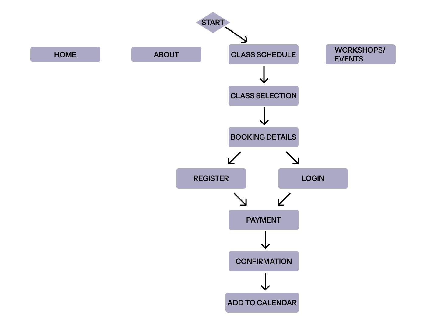
User Flow
Starting from the homepage or navigation options like "Class Schedule" or "Workshops/Events," users can easily explore offerings, view class details, and proceed to book. The flow accounts for both new and returning users, offering clear registration and login paths before payment. Once a class is booked, users receive confirmation and have the option to add it directly to their calendar. This streamlined flow prioritizes ease of use, minimizes friction, and aligns with user needs uncovered in the research phase.
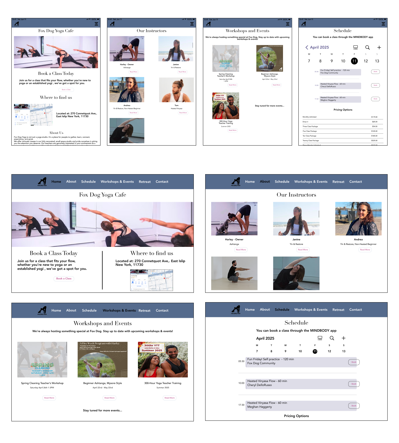
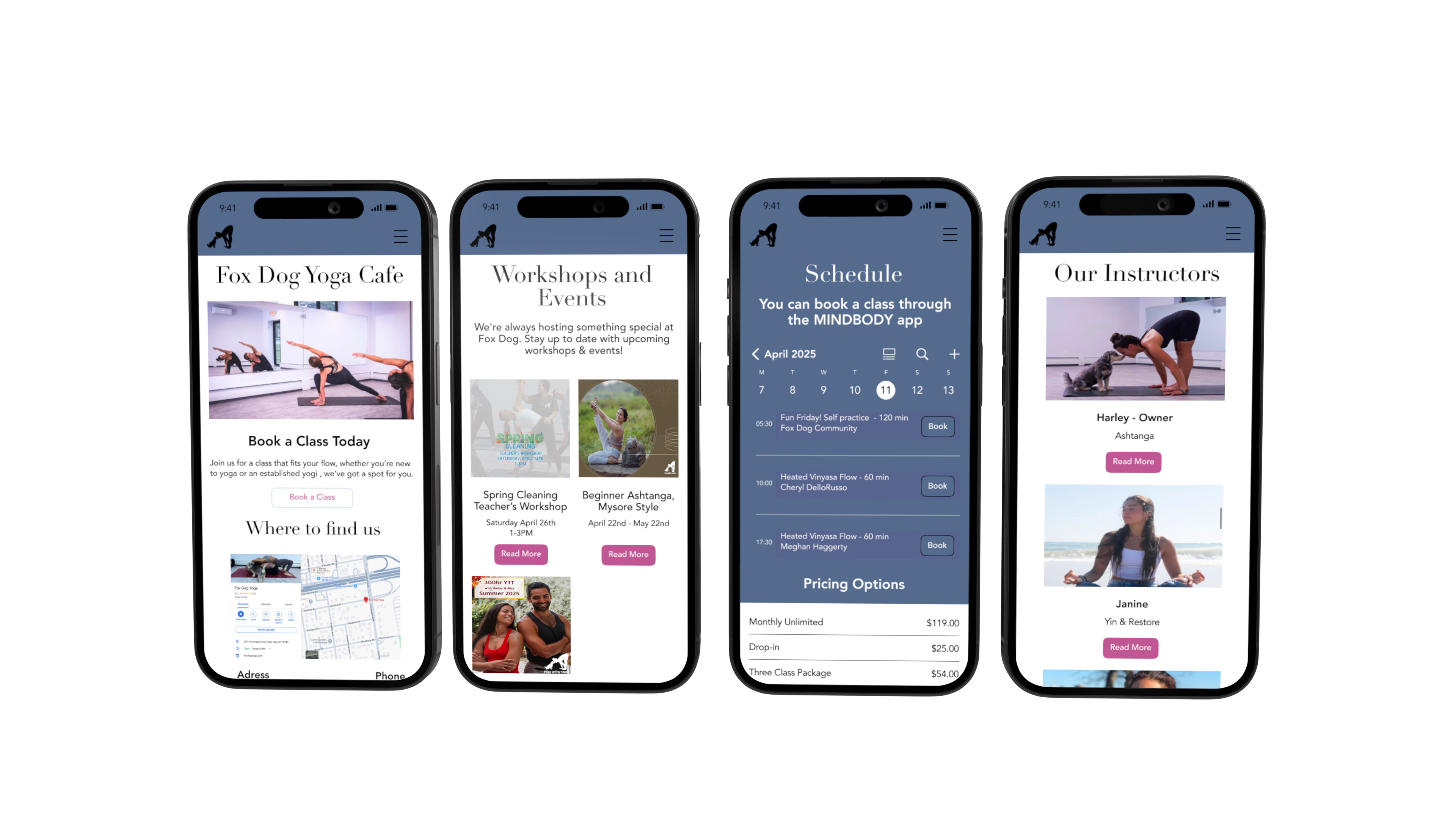
In the wireframing phase, I translated user insights into low-fidelity layouts to structure the site’s core features and navigation. These wireframes focused on simplifying class booking, improving schedule visibility,
For the mid-fidelity wireframes, I refined the layout structure and functionality, focusing on hierarchy, usability, and responsive design across devices.
The high-fidelity wireframes brought the brand to life through typography, color, and imagery, creating a polished, intuitive experience aligned with Fox Dog Yoga’s identity.
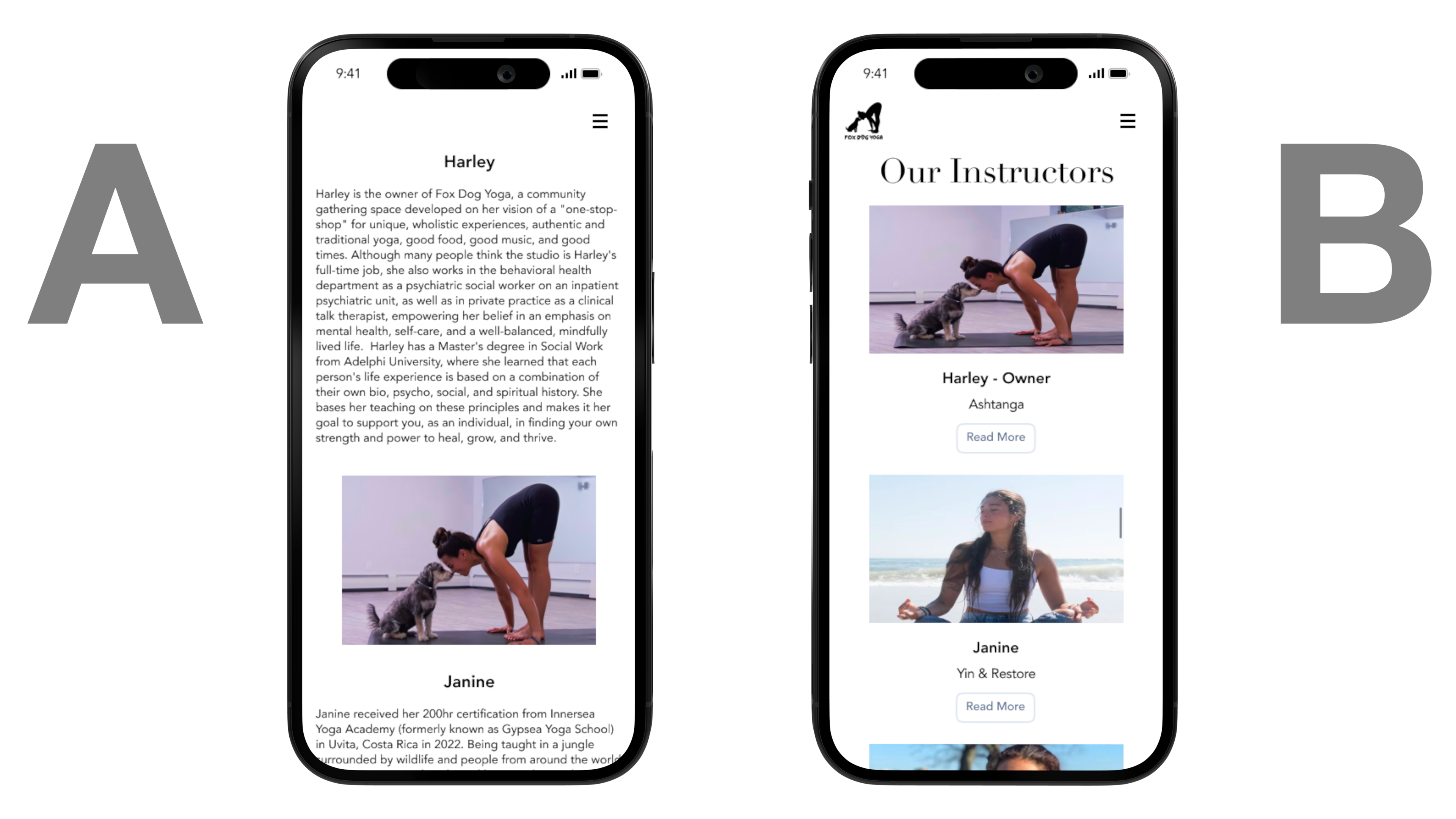
To evaluate layout preferences and usability, I conducted A/B testing on two redesigned pages: the “About Us” page and the “Class Schedule” page.
52 participants provided feedback, helping identify which design layout users found more intuitive and visually effective. Both screens "A" are the previous style of the mobile website, "B" is the new redesign version.
84% of participants preferred Option B of the "Schedule" page due to easier navigation and a more intuitive booking experience.
96% of participants chose Option B for the "About Us" page for its clearer layout and improved readability
“I think both versions work well! Version A has a lot of information that gets lost under the fold and may prevent the user from continuing to scroll. I really like what you have going for Version B but I think you could push it a bit further. Try playing around with drop down “info boxes” so basically Version B with a dropdown that opens up a box with all of the info Version A has.”
“I like the lack of overwhelming text on he instructor page in example b. some of us just can’t read much without getting frazzled 😵💫. i like the calendar view (b) that is more familiar/similar to the calendars I use at work and in my person life. i also like the list of price ranges at the bottom. both could work though.”
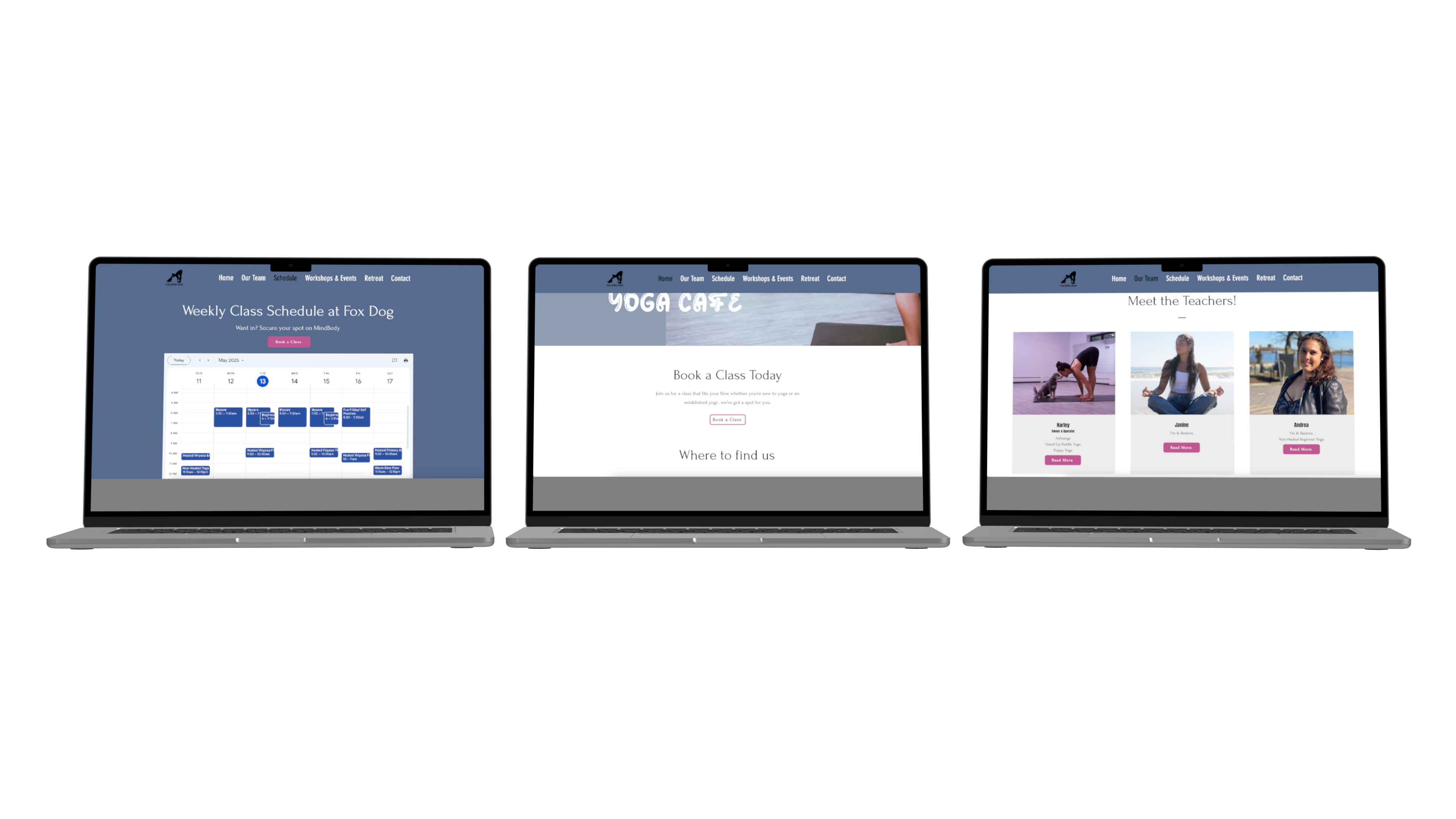
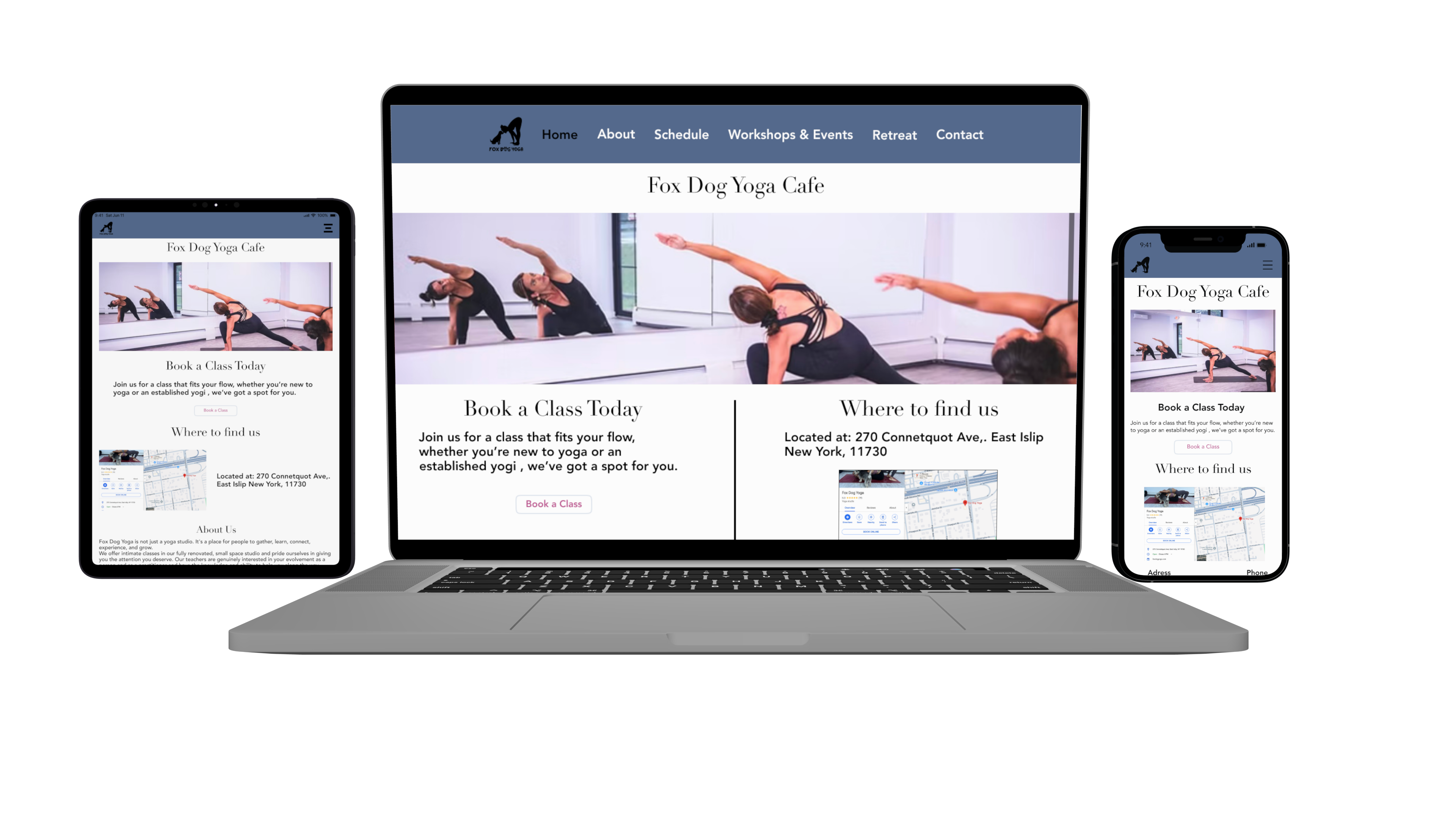
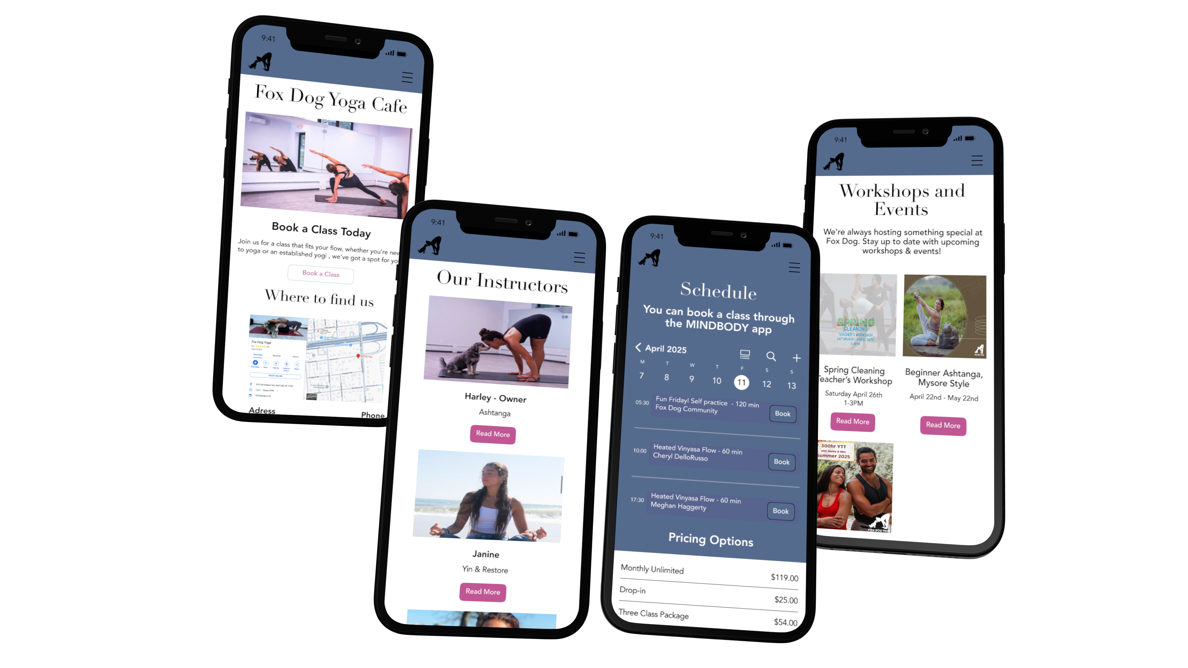
To ensure a seamless experience across all devices, I designed responsive layouts for key pages including the homepage, class schedule, workshops/events, and about us. Each layout adapts to screen size while maintaining clarity, accessibility, and consistent branding to support users whether browsing on mobile, tablet, or desktop.
Redesigning the Fox Dog Yoga website reinforced just how important it is to listen to users and keep things simple, clear, and accessible. One of the biggest takeaways was the need for a cleaner layout and easier navigation—users wanted to find class schedules, pricing, and booking options without digging through multiple pages. Mobile optimization was also a major focus, as most visitors browse and book from their phones. Improving the visual style with a calming color palette, better typography, and high-quality images helped align the site with the studio’s welcoming and peaceful vibe.
Looking ahead, the next steps will involve collecting feedback from real users as they interact with the updated site to see what’s working well and what can still be improved. Running a round of usability testing will help fine-tune the mobile experience even more. Adding tools to track user engagement will also provide valuable insight for future updates. The goal is to continue refining the site so it not only looks great but also makes it easy and enjoyable for people to connect with the studio.