Mindful Menus

Welcome to Mindful Menus, where every recipe is crafted with care to nourish both body and soul. Join us on a journey of culinary delight and conscious eating.
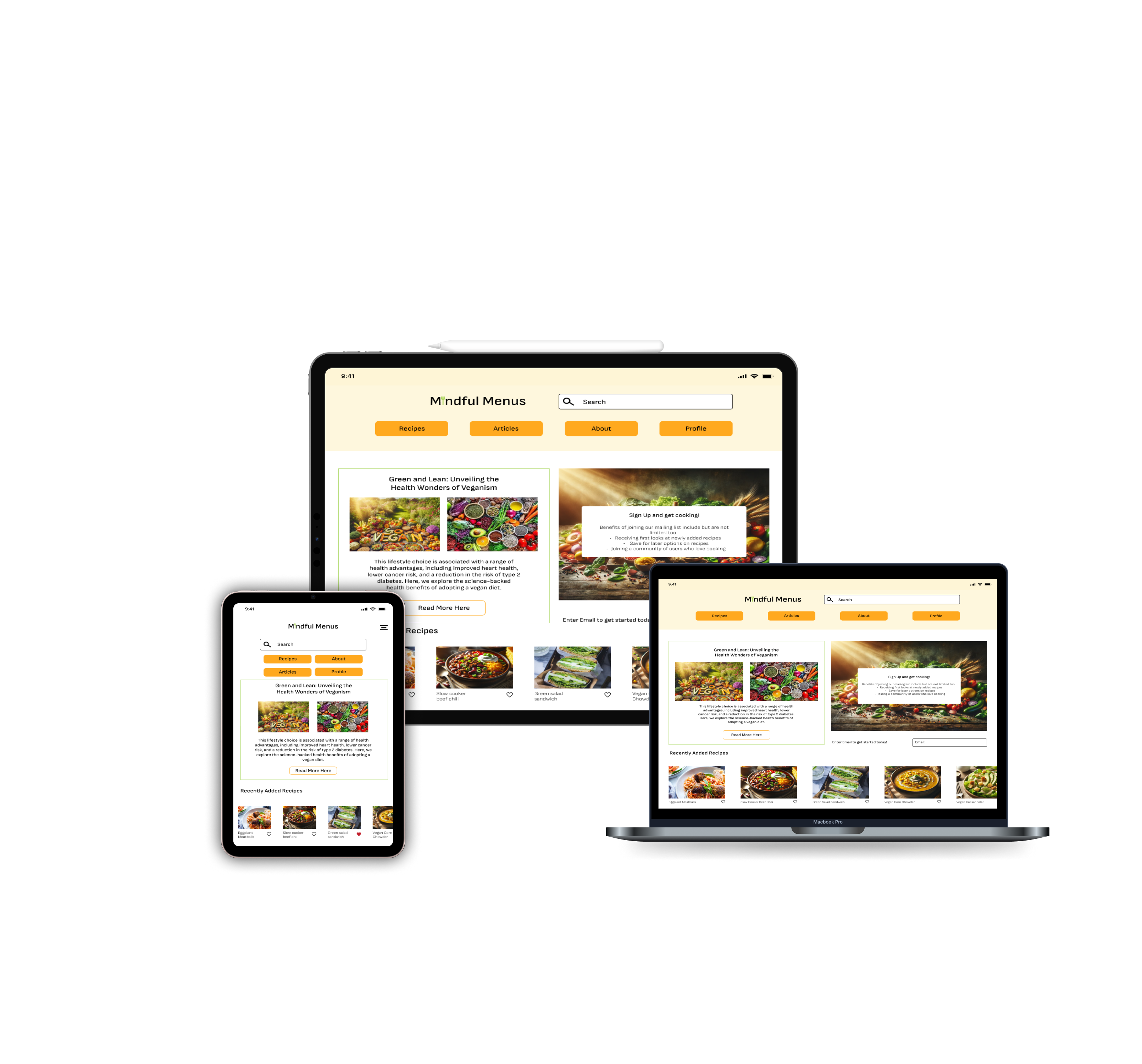
Mindful Menus is a responsive recipe web app, designed for IOS users who range in confidence in the kitchen from beginner to expert.
Figma
Google Draw
UX/UI Designer
1. User Research
2. User Interviews
3. User Personas
4. Style Guide
5. User Flow Diagram
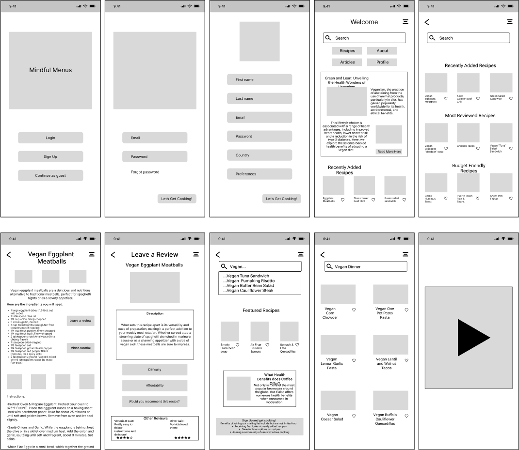
6. Wireframing
7. Usability Testing
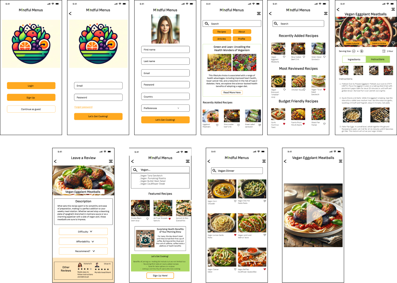
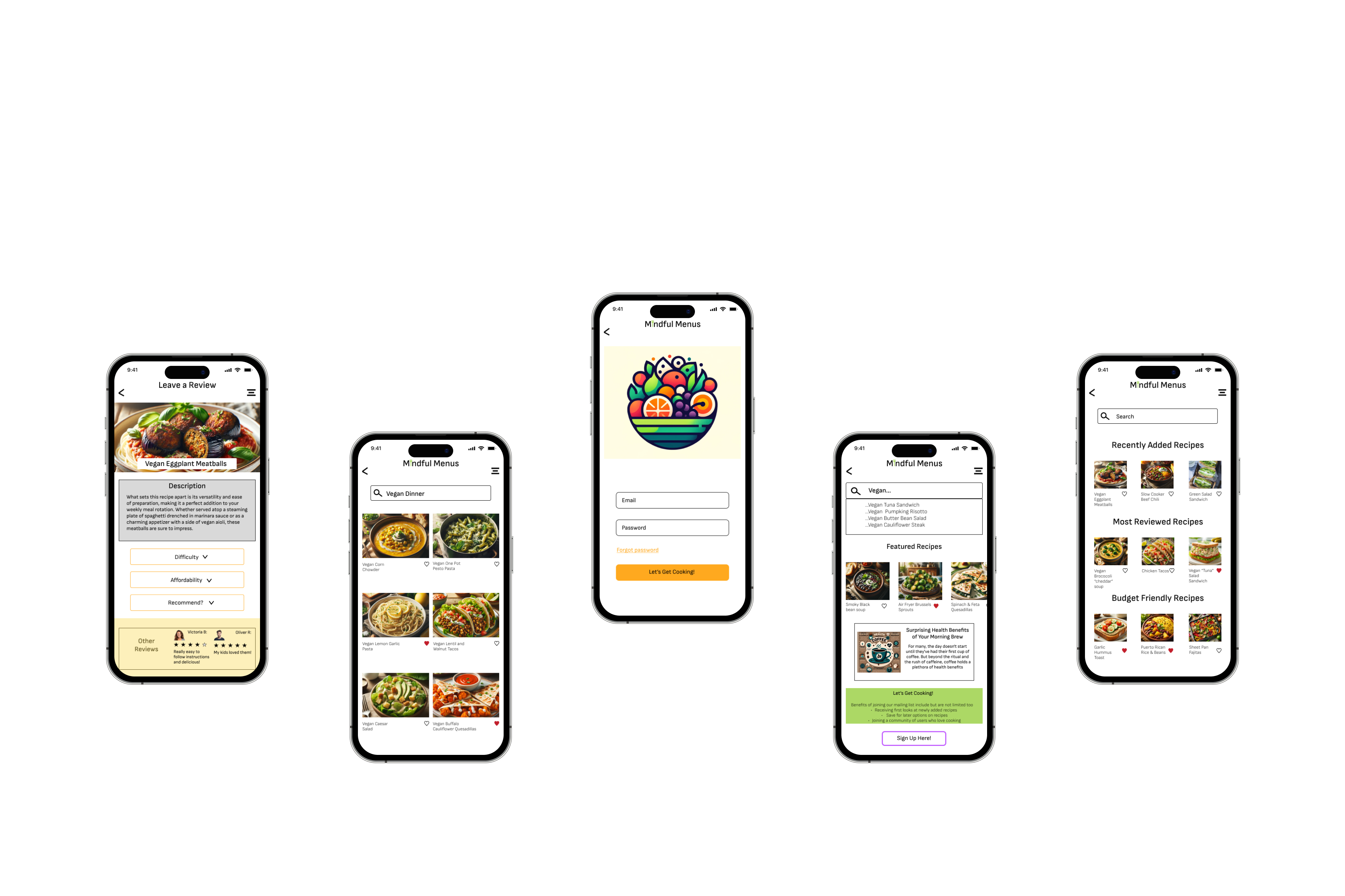
8. Mockups
Answering the following questions helps ensure my decisions are grounded in real user needs, behaviors, and contexts. Allowing me to design a recipe web app thats intuitive and accessible, by understanding who I am designing for, what they want to achieve and how, when and where they will use the product.
Designing an app for everyone in the kitchen wether they are beginners or experienced. Also including options for people with dietary restrictions and intolerances.
Users will be able to search for particular recipes. Written instructions, photos and video guides will be available for assistance.
The user will engage with the product before they cook, while they are cooking, and after they cook. As well as while they are in the supermarket shopping for ingredients, or in their spare time browsing for recipes.
Users will engage with the app in their own home, their family or friends home, and the supermarket. They can engage on several different devices being phone, tablet, or desktop.
The product will be easy to use and beginner friendly. The user will be able to search for recipes specifically catered to their own dietary needs and restrictions. The user will have access to a web app and mobile app that are both free to use.
The user will search for a particular recipe, or browse through the accessible recipes. The user will follow the step by step instructions provided via written, photos and video guides. The user will be guided start to finish in this app from preparation to clean up.
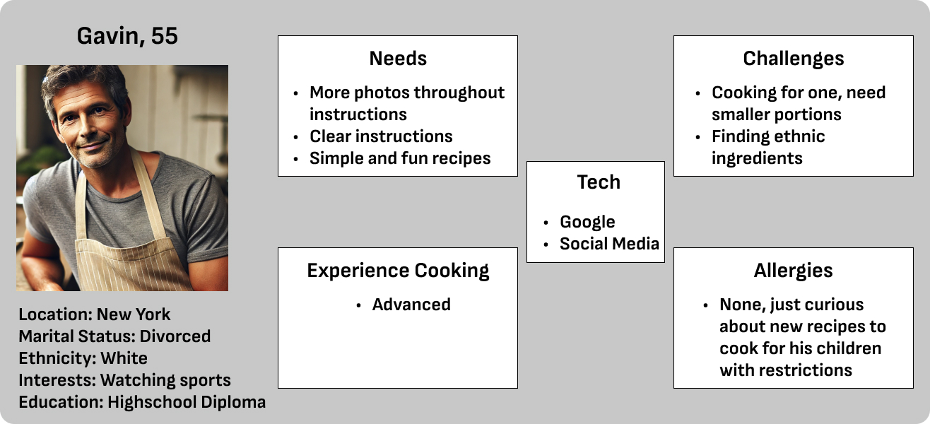
User interviews were performed on 3 participants with skills ranging from beginner to advanced in then kitchen. Helping gather necessary feedback on what the app should and should not contain from potential users.
1. Do you have any dietary restrictions, do you know anyone with dietary restrictions
2. Does the pricing of ingredients have a factor in how you decide your meals, if so please explain.
3. When looking up recipes what challenges have you faced
4. What information and features would you like to see on a recipe app
1. Participants look for more budget friendly options when cooking.
2. Frustrations with the need to be more clear and concise in the step by step instructions.
3. Participants want video tutorials and guides to walk them through the recipes
4. Participants would like to see specific brands of ingredients suggested on the app
User personas were created based on the three participants included in the user interviews. Showcasing their needs, challenges, what tech they use and any allergies they have that would prevent them from using the app effectively.

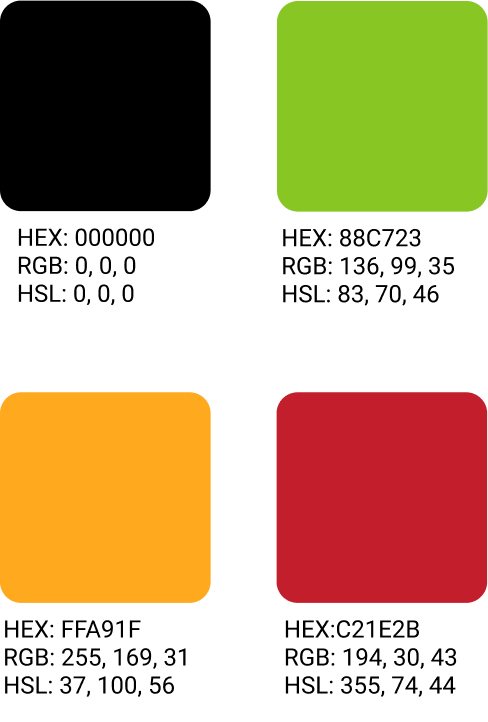
HEX: 00000 should be used for all copy
HEX: 88C723 should be used as an accent color
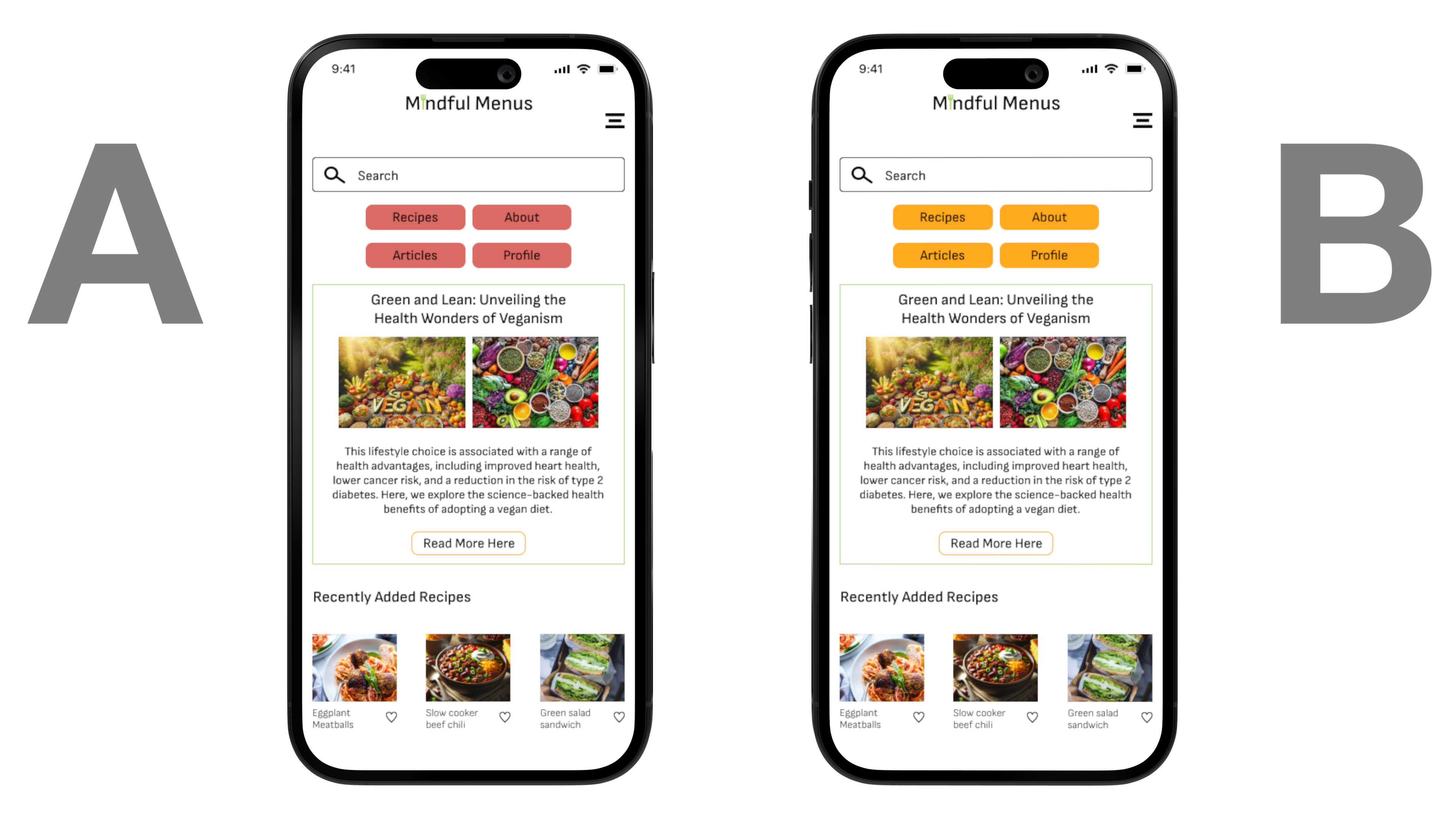
HEX: FFA91F should be used for all buttons and as an accent color
HEX: C21E2B should be used as an accent color for icons
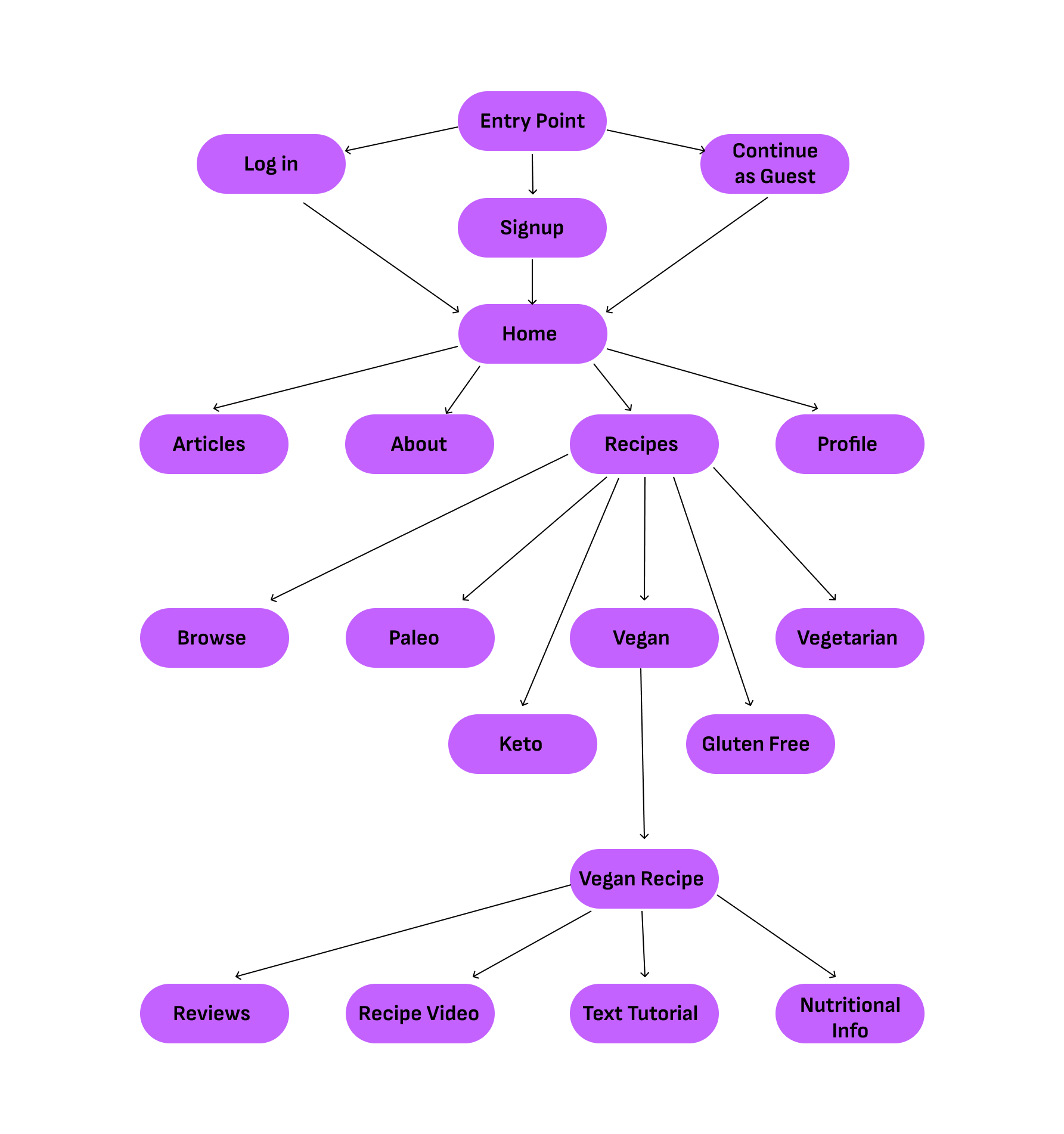
Low-Fidelity wireframes were sketched on paper to gain a feel for how the app should look and function. After this Mid/High-fidelity wireframes were created in Figma to show the changes made along the way through the designing process and move on to testing and responsive design.

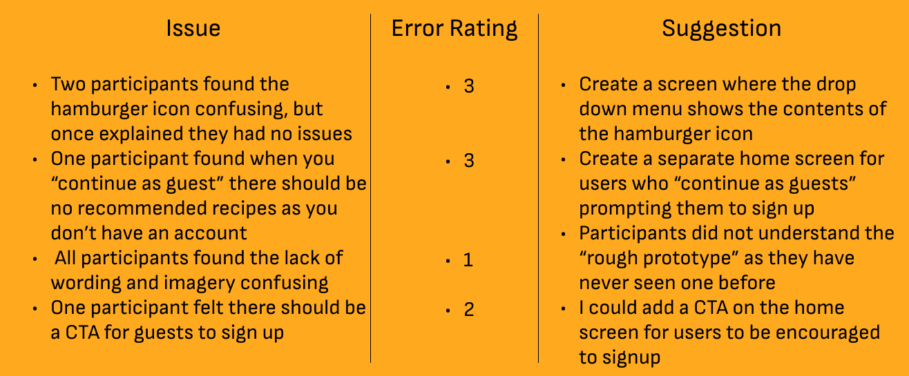
The goal of this exercise is to observe the users, and their ability to navigate the app for the first time. The users will be given three specific tasks to complete and will be observed while doing so in hopes of collecting information on pain points and what the user enjoyed about the app. This will help with further development of the web app.
Tasks
1. You open the app and signup for an account, once signed up you will find a recipe and leave a review on one once chosen.
2. You open the app and continue as a guest, find a recipe you would like to choose by browsing the available recipes
3. You open the app and log in as if you are a returning guest, search for a recipe, and find the video guide tutorial to watch, then return to the home page.
Using the feedback provided from participants, I was able to compile a results synthesis and error ratings for issues found within the design.
Low and high-fidelity wireframes laid the foundation for iterative feedback and design improvements, while mockups and responsive design ensured the solution's adaptability across various devices. User interviews, user testing, and A/B preference tests provided invaluable insights, allowing the design to be refined based on real user needs and preferences. The result is a well-rounded, user-friendly design that meets both the client's objectives and users' expectations. Following the conclusion of this project, I learned the value of testing early and often. Looking to gather feedback early in the design process allowed me to make changes and iterations to develop the product as quickly and effectively as possible.