FormFit is looking to solve the following problems users currently face with similar apps on both IOS and Android platforms
- Subscription costs (offering a limited free workout library to those who do not sign up, and more customizable features to those who do)
- Limited accessibility (offering low impact exercises and variations to those who are disabled or unable to perform certain exercises)
- Lack of motivation (being able to track progress and log workouts will keep the user motivated to continue returning to the app)
- Too complex (the app will be simple and easy in its navigation so users feel confident while using the app)
Figma
Google Draw
Rotato
UI/UX Designer
Competitor Analysis
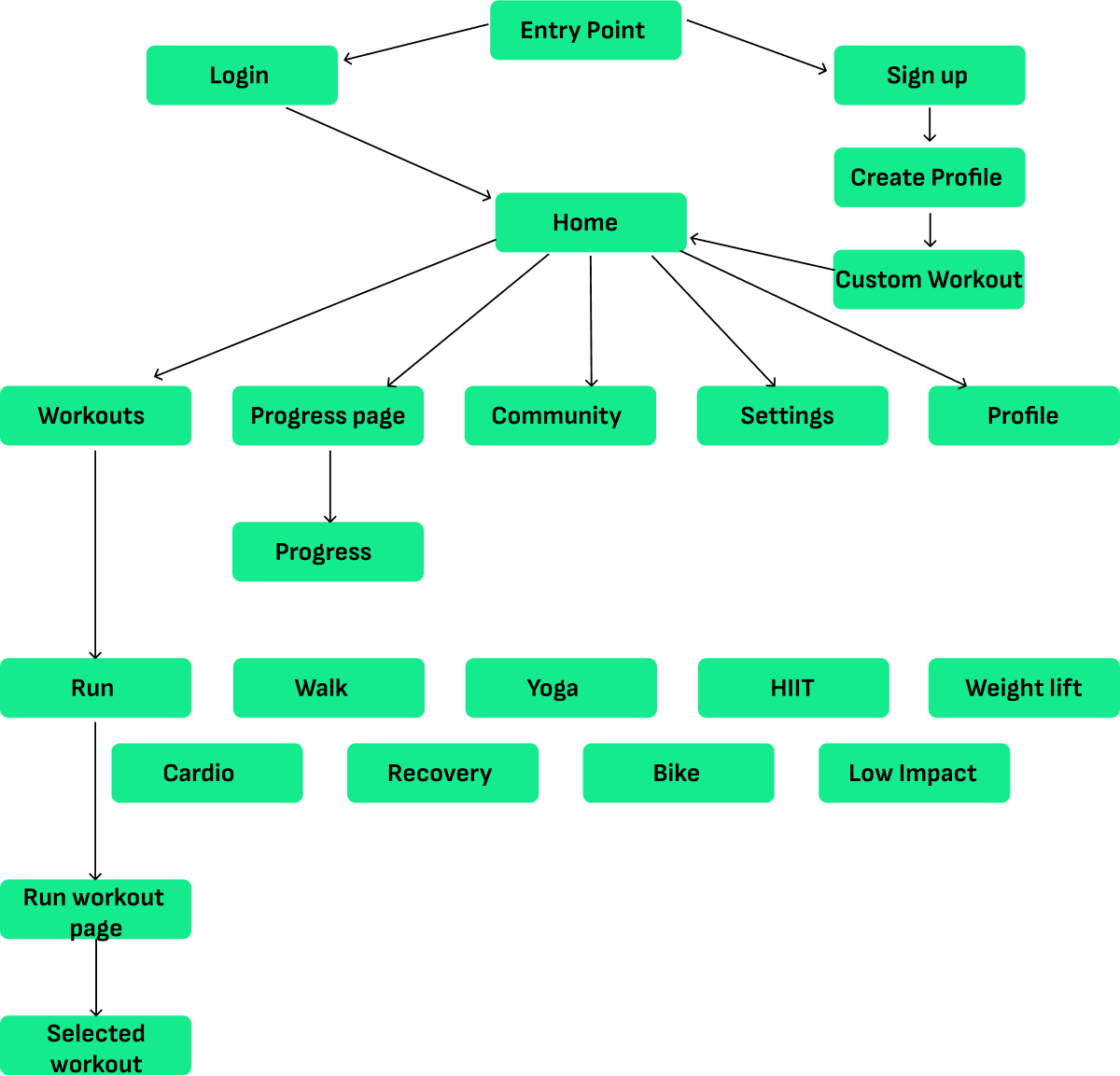
User Flows
Mid Fidelity Wireframes
High Fidelity Wireframes
User testing
Prototyping
Age: 18-40 years old, with a primary focus on Millennials and Gen Z who are accustomed to using mobile apps for lifestyle management.
Location: Urban or suburban areas where there is a stronger fitness culture and access to various workout spaces (gyms, studios, outdoor parks).
Fitness Enthusiasts: Users who are already invested in their fitness and want to explore new workouts.
Fitness Beginners: Users who want a simple way to start their fitness journey.
Community-driven: Users who thrive on social support, challenges, and motivation from like-minded individuals.
Flexible Workout Preferences: Users who like variety and switch between different workout categories, such as yoga, strength training, cardio, HIIT, and more.
Convenience Seekers: They want workouts that fit their schedule—whether at home, in the gym, or outdoors.
Difficulty Staying Motivated: By connecting users with a community, the app helps them stay accountable and motivated through social interaction and fitness challenges.
Tracking Progress: Users want a reliable and easy way to track their progress, set goals, and adjust their routines as needed.
Following Human Interface Guidelines and Material Design Guidelines, icons were created and styling was done ensuring to follow each one's native patterns. You can see the difference between both IOS and Android icons below.
“Shred” and “Workout” were analyzed to find patterns, interesting features and layouts that could be a beneficial addition to the app or making note of things to steer clear from.
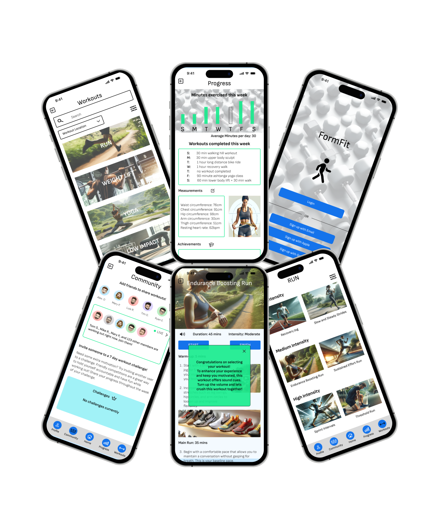
A visual on the progress screen for workouts completed during the week is an addition I felt would beneficial to implement into my own design
Having a “community” for users to share progress, workouts, and compete with one another. Helping users stay motivated increasing time spent on the app itself.
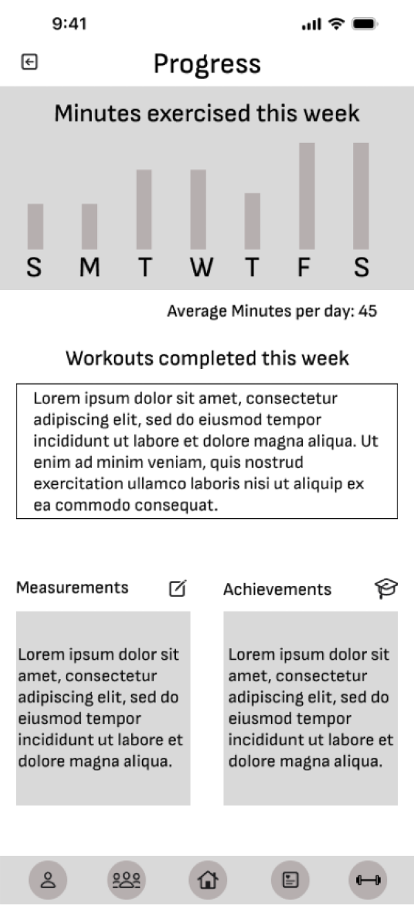
Screen updated to motivate users by showcasing their progress shown throughout the week.
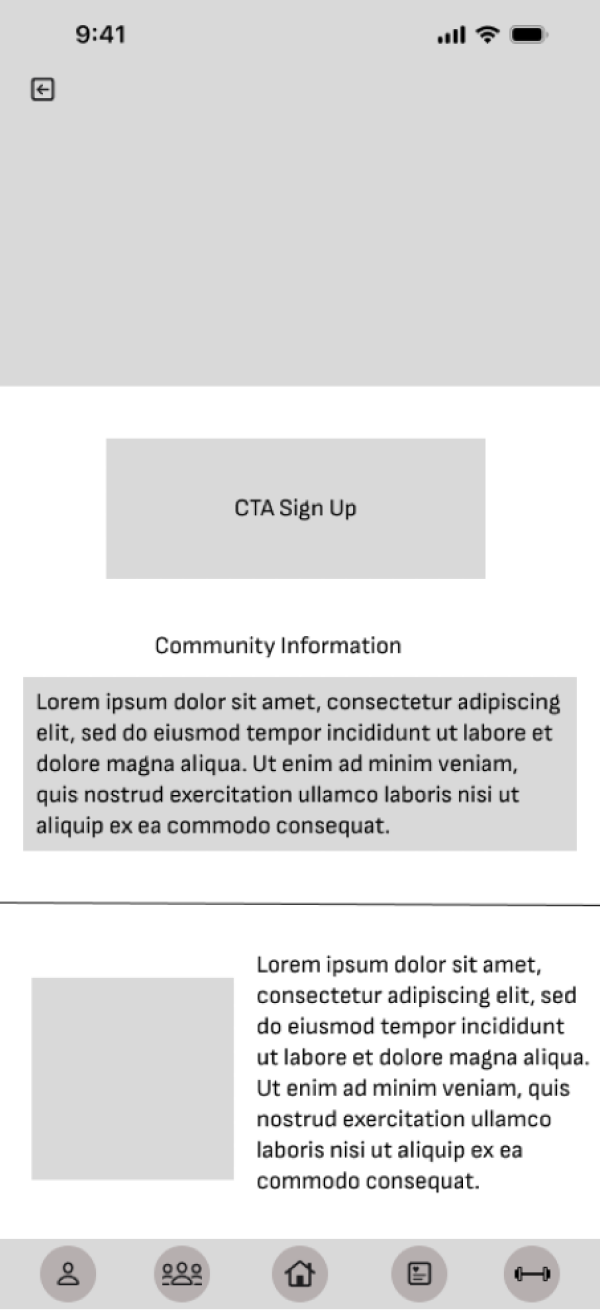
Screen updated to show a CTA to signup as well as having community information shown on the homepage, so users can share with others using the app.
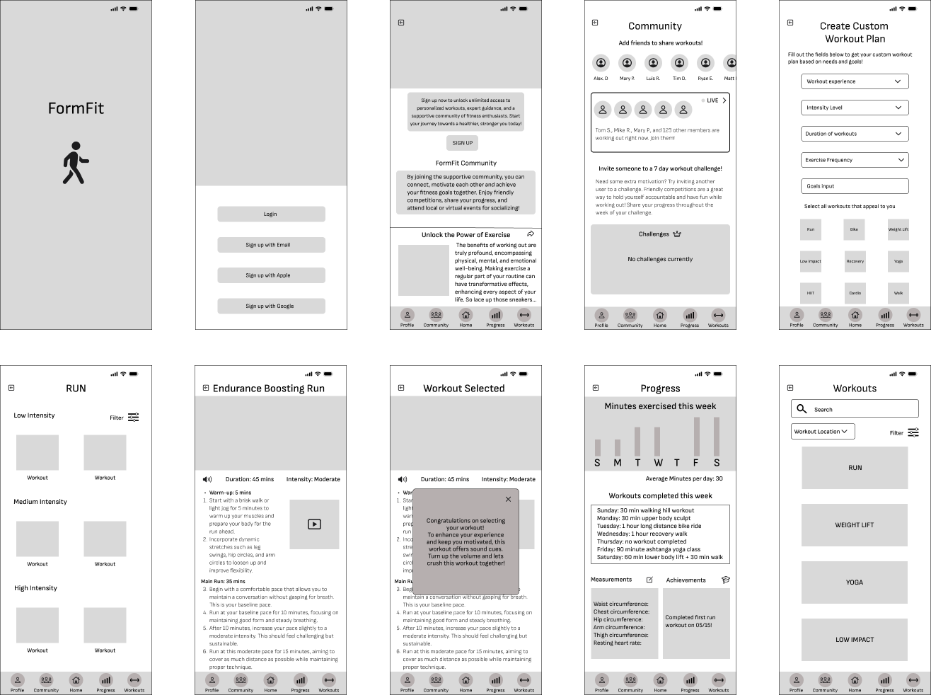
Showcasing how a user would complete the following tasks
- Complete a workout
- Track progress
- Create a custom workout plan
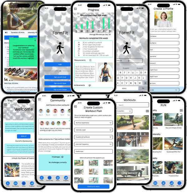
I designed wireframes for both iOS and Android, showcasing platform-specific UI patterns within Figma. This project highlights key differences in typeface, navigation styles, and visual elements—such as iOS's softer rounded edges and Android’s Material Design shadow effects. By tailoring the experience to each platform's design guidelines, I created a seamless, native feel for users across devices.