
UX/UI Designer
Money-saving app designed to help users quickly reach their financial goals for big purchases. Focusing on user research, wireframing, and prototyping to create an intuitive, goal-based savings experience.
Figma
Rotato
Google Draw
Style Guide
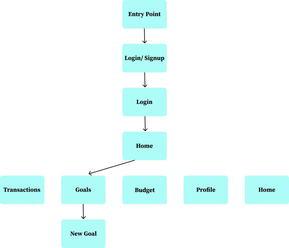
User Flow
Wireframes
Responsive Design
User Testing
Mockups
LOGO
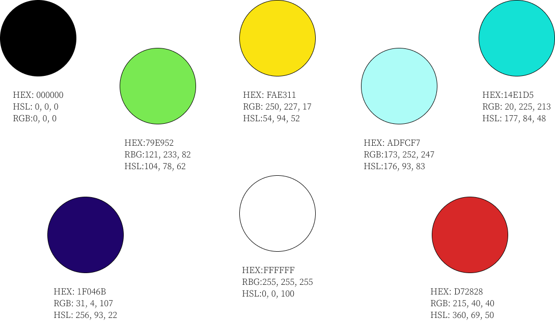
color palette
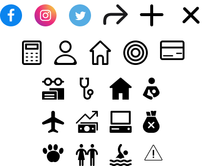
iconography
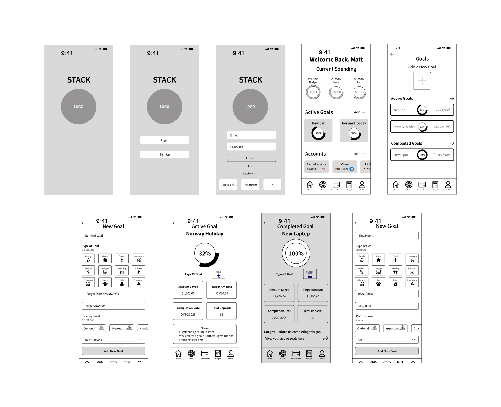
LOW-FI
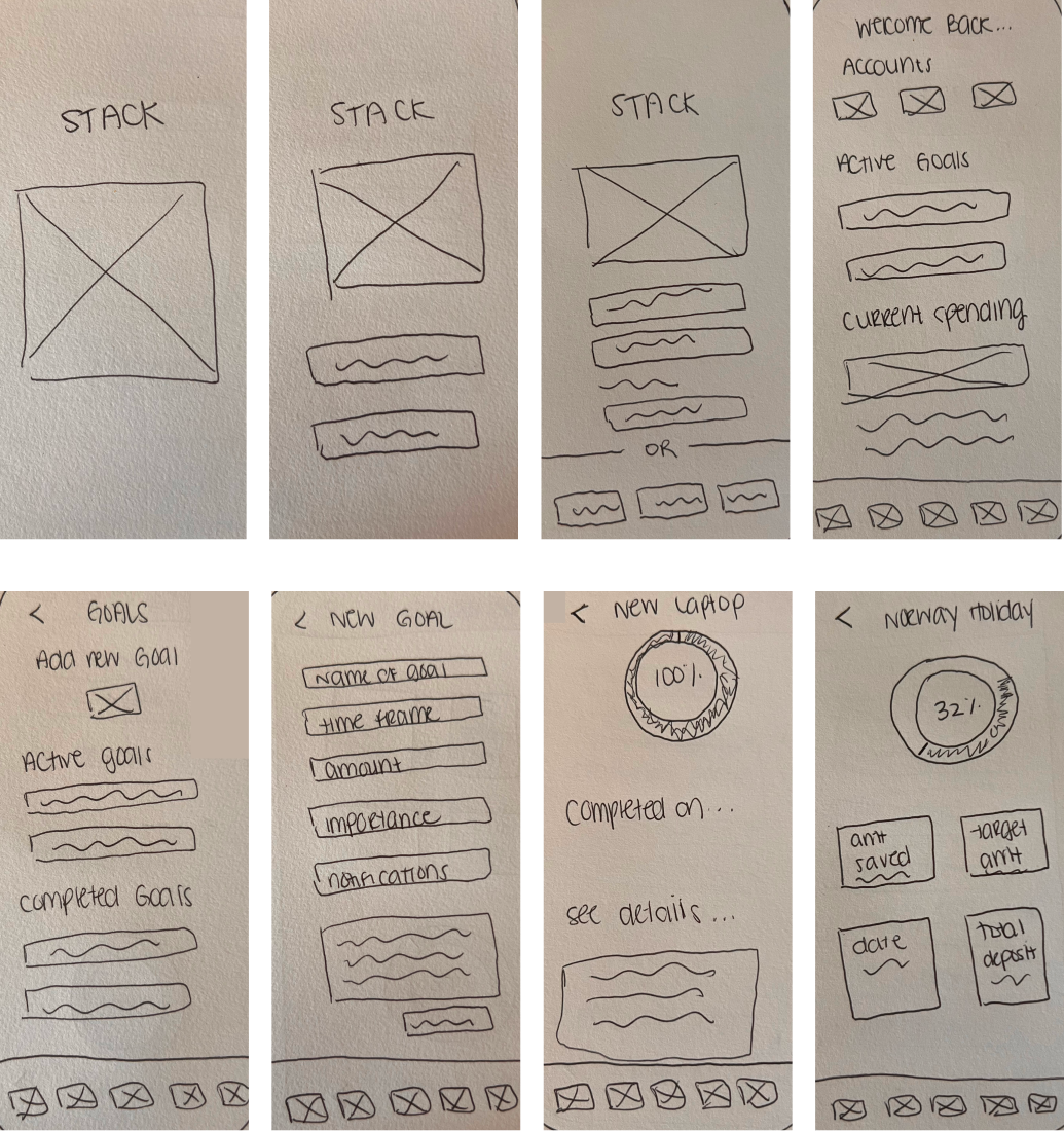
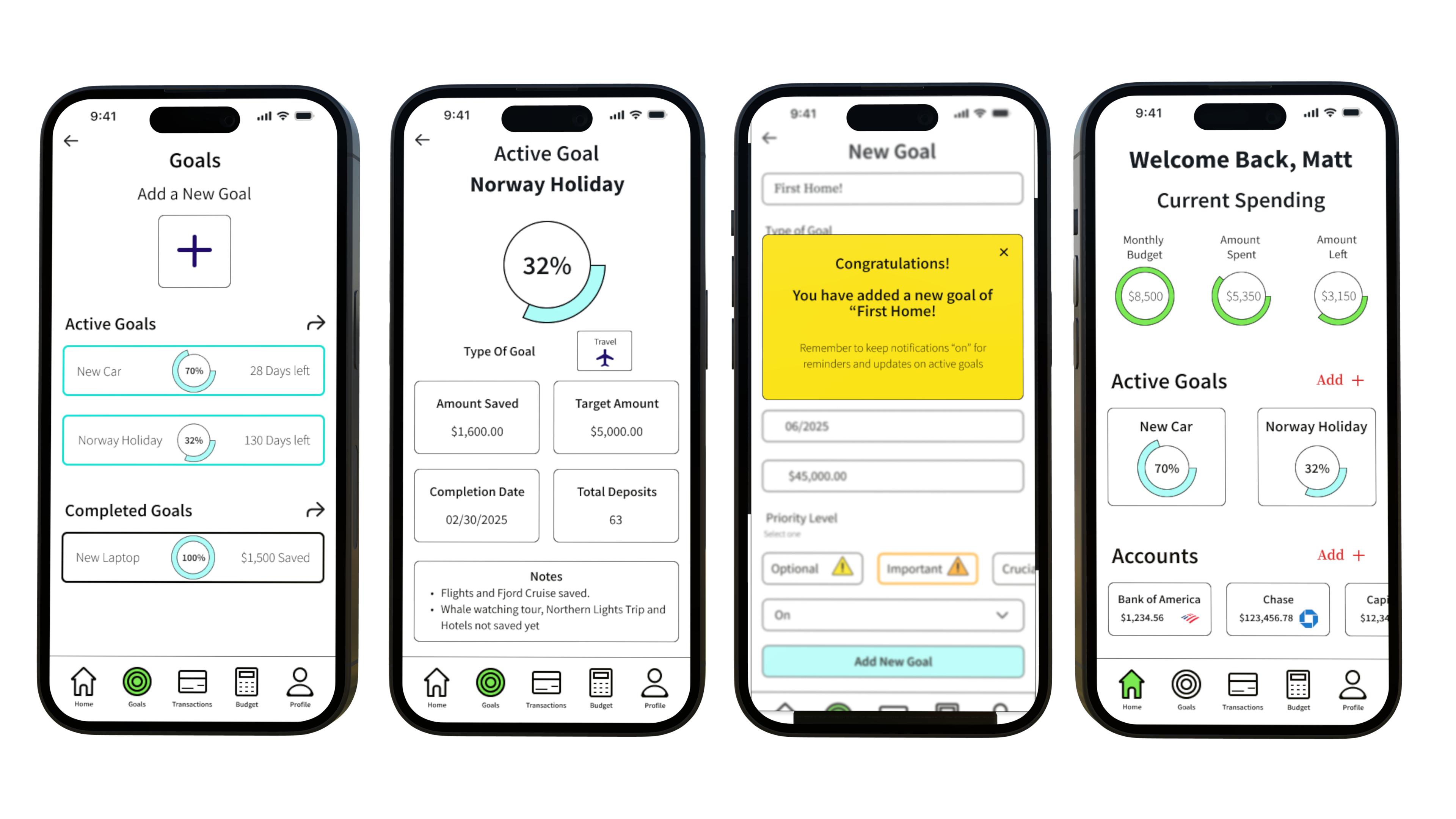
First I sketched low-fidelity wireframes on paper to visualize ideas than moved into Figma to create mid/High-fidelity wireframes to use for prototyping and user testing.
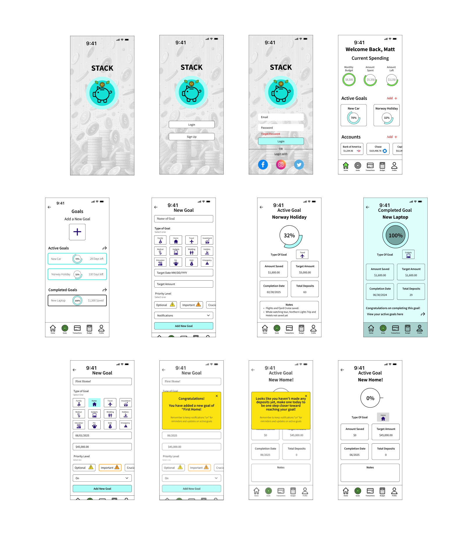
MID-FI
HIGH-FI
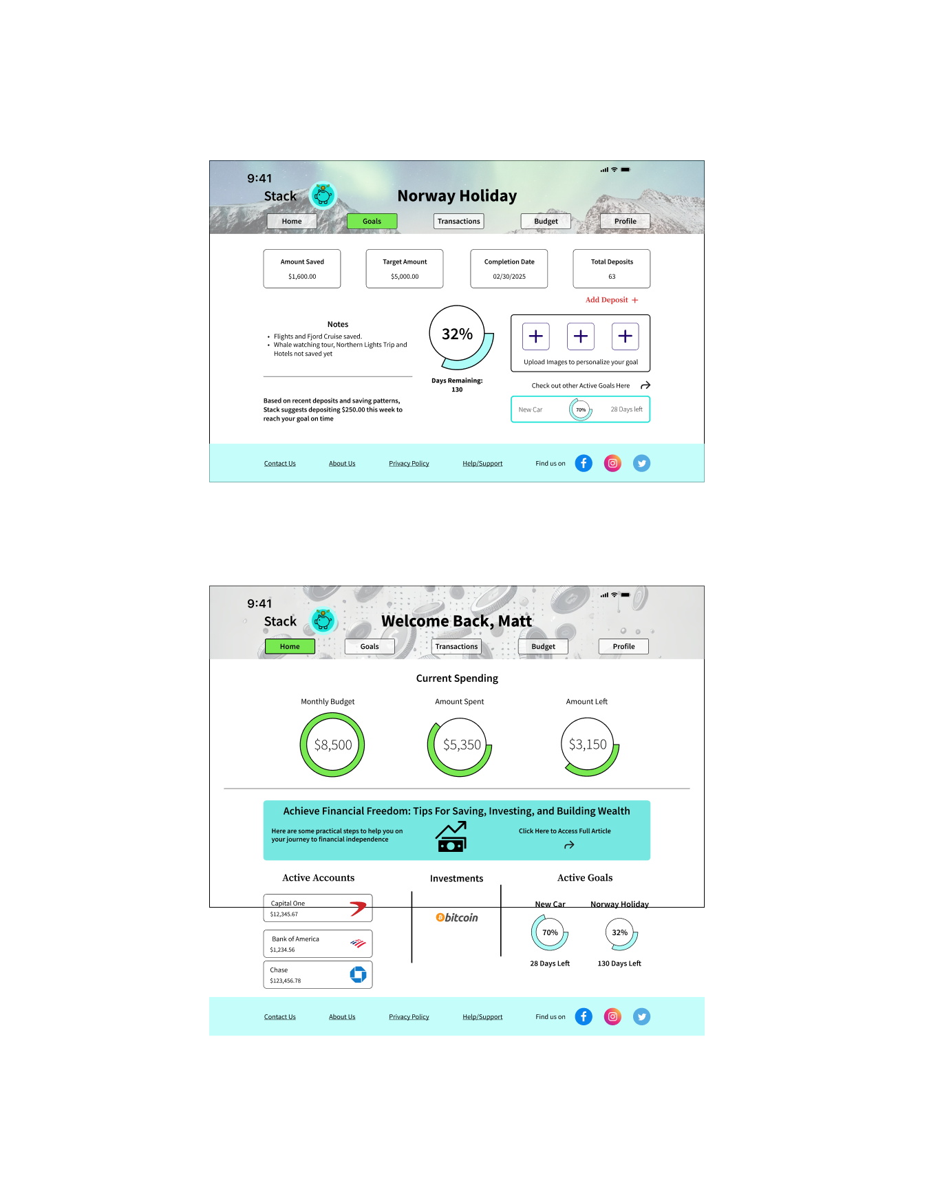
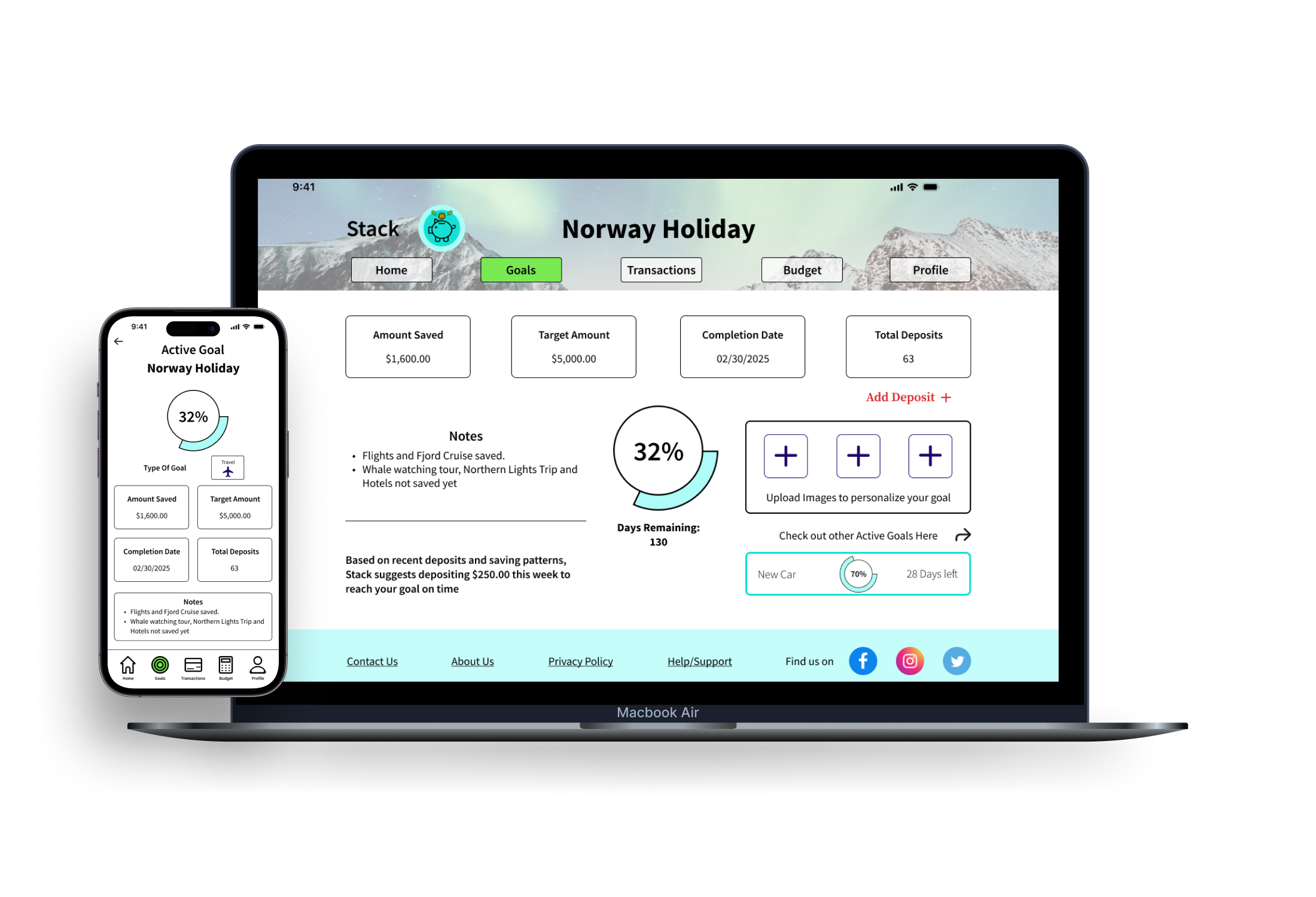
The “home” and the “holiday savings” screen were observed to find the break points at different sizes. Once the break points were defined, the screens were created to show how the app adapts on different platforms. Desktop designs show the differences between breakpoints with added imagery and content.
User 1:
Male
Career Foundry Student
IOS User
User 2:
Female
Career Foundry Student
IOS User
User 1:
Female
Teachers Aide
IOS User
- Very user friendly
- Progress meter placement is on point and flows nicely
- Elements are spaced out nicely
- As a returning user, logging in was easy and intuitive
- Likes to see current spending at a quick glance on home screen
- Being able to add accounts quickly on the home screen
- Easy to use and navigate
- Current goals and completed
- Goals on the homepage to encourage users to keep saving
- “Investments” in navigation bar is Cut off on the prototype
- “Type of goal” on completed goal screen could use the same weight as the “congratulations”
- No “submit” button for the new goal being added
- Couldn’t find a way to finish adding the goal to the account- Wanted to see more color
The heading STACK jumps placement from screen to screen
- Make “welcome” a bit bigger
- For notes section, having numbers or bullets to differentiate between the notes added
- Adding a “add new goal” button on the home screen similar to that of the adding a new account
- Adding some pop up features that show up when the user completes adding a new goal, like an animation or congrats screen
STACK successfully delivers a robust yet simple platform that empowers users to save money quickly for big purchases and achieve their financial goals. By combining user-centered design principles with an elegant interface, I have created an experience that is not only functional but also visually engaging and easy to use. This case study demonstrates the importance of an iterative, user-focused approach in building apps that address real-world financial needs while providing a seamless, enjoyable experience.